4Ocean
About The Project
As an organization that blurs the line between commerce and social responsibility the web property needed to also function as both traditional e-commerce as well as subscription and donation models. The audiences for each model need to be carefully considered and funnels built to cater to the very different mindsets that reflected the behaviors of each audience.
Role: UX/UI Designer
Employed by: 4ocean

Challenge
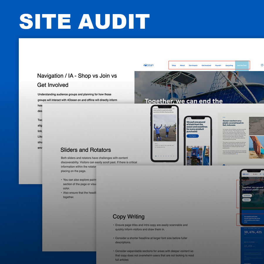
While the business model is not that of a traditional e-commerce product company there was not shortage of best practices that could be applied to site. After the initial site audit opportunities for accessibility enhancements in both the UI and markup were identified. In addition to that there were lots of areas to balance out the story telling with proven conversion tactics by reprioritizing content throughout the page and placement of key actions.


Best Practices
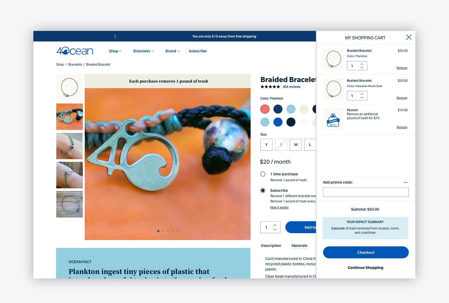
The site is built on the Shopify platform which allowed for easy integration of apps. Along with some custom theme enhancements the addition of a minicart, reviews, and additional layouts all help tackle some common practice e-comm patterns.
Non-profit or Commerce?
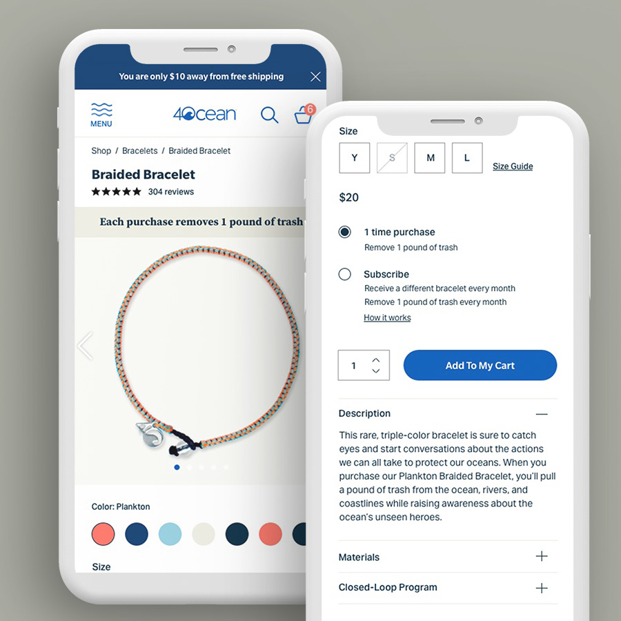
4ocean sells products direct but also has a monthly subscription and a donation model. The previous architecture treated these flows as completely separate. With the redesign incorporating the subscription model as an option within the PDP brought an opportunity to upsell and introduce enthusiasts to other ways of being involved.
Information Architecture
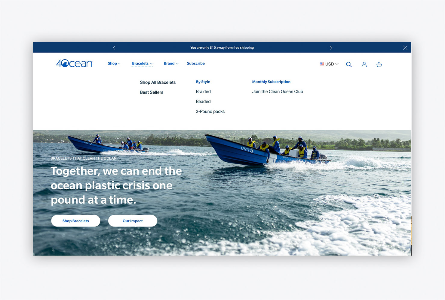
As their programs evolved the site organization needed to evolve with it. New product offerings as well as promotional combinations were previously limiting the organization for rolling out new strategies or hindering the ability to feature them on the website. With a new look at products, variants, and subscriptions the site updates empowered strategy teams to update catalog offerings.


