T-Mobile Design System
About The Project
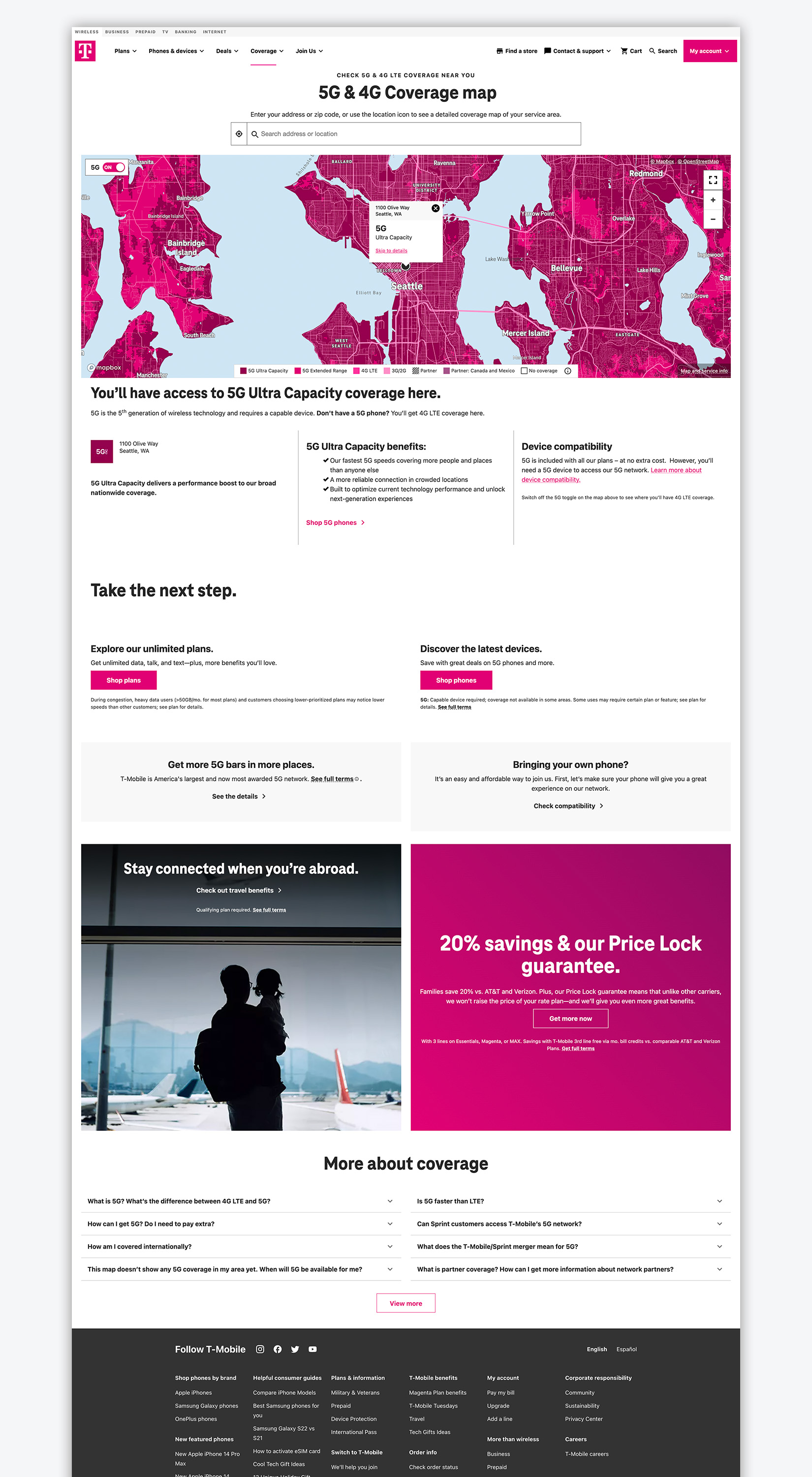
While on the design systems team for T-Mobile web and app team I was in charge of standardizing search and interactive coverage maps across platforms.
Role: UX Designer
Employed by: Blink UX
Challenge
In the telecommunications space the brand perception of coverage is a top deciding factor when choosing a carrier. T-Mobile is a smaller carrier in terms of market share but with the acquisition of Sprint they have the largest 5G coverage in North America. The website struggled to balance the marketing push to show great coverage nationwide and the usability of a support tool to help customers and prospective customers understand coverage.
Research
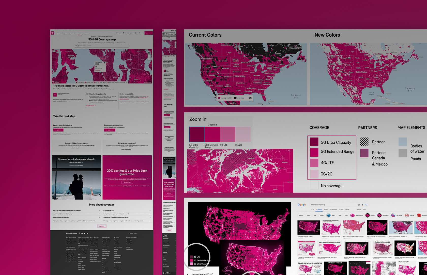
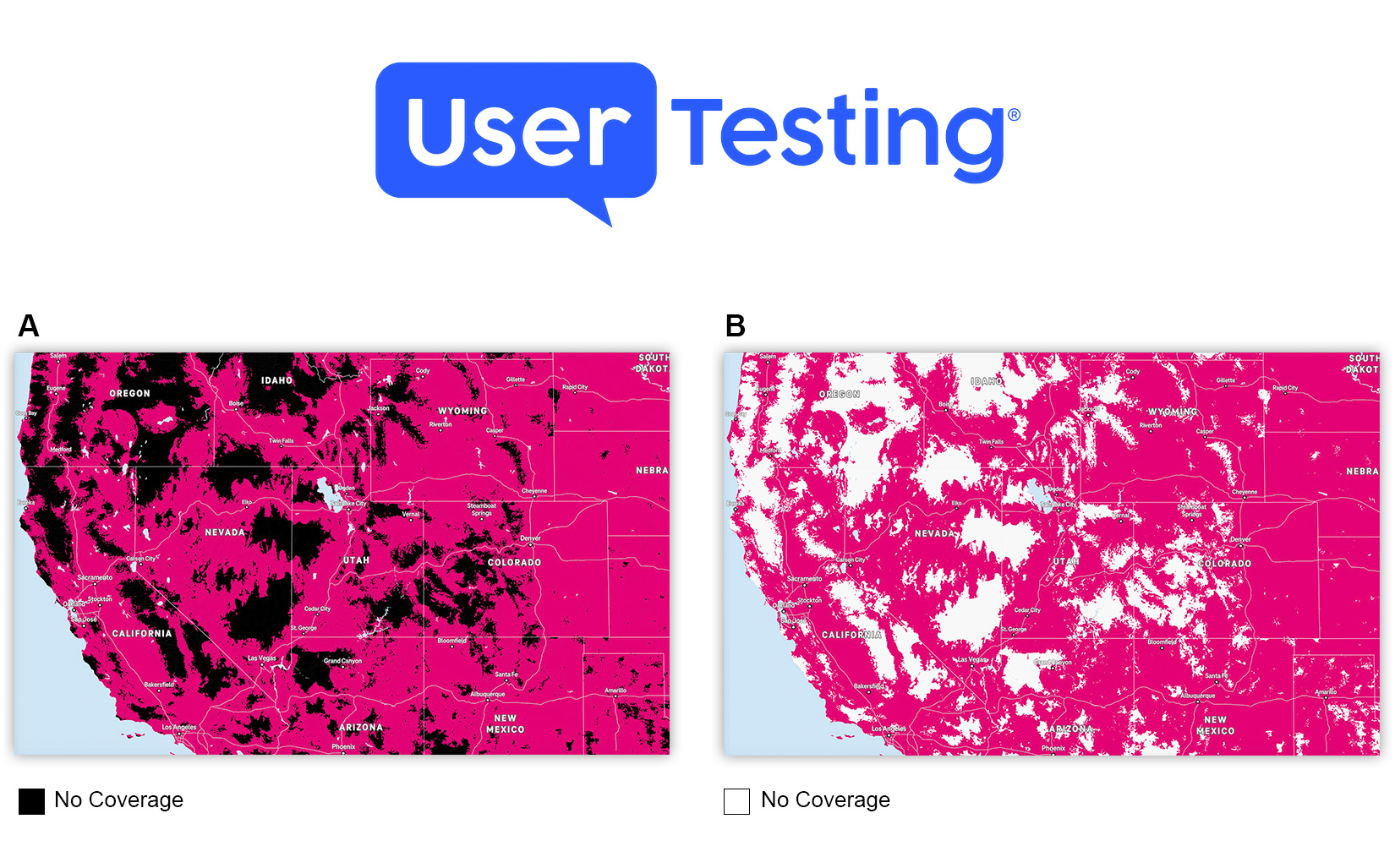
We conducted a series of ongoing user studies both moderated and unmoderated to gain understanding of how users perceive color. The design constraint of using the T-Mobile brand color to represent coverage offered a challenge when determining a color pallet that was accessible, delivered and favorable brand perception, and also let users clearly understand what coverage experience they could expect in a specific geographic area.
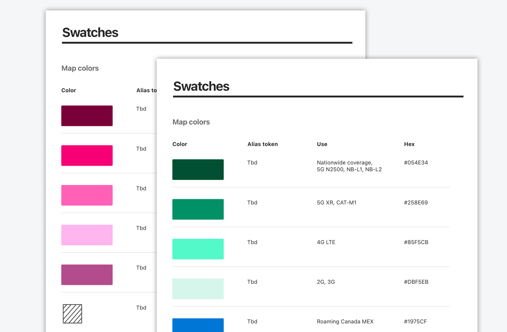
Pattern Library and Tokens
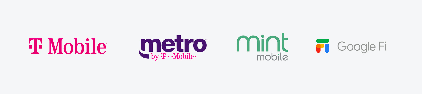
Once a color scale was identified the design patterns needed to be genericized in order to be leveraged across the different brands that use the T-Mobile network. The pattern library was managed in Figma and design tokens were defined allowing the different development teams to quickly stand up versions of the coverage map for the various brands that wished to provide a similar web tool to their customers.