Béis Travel
About The Project
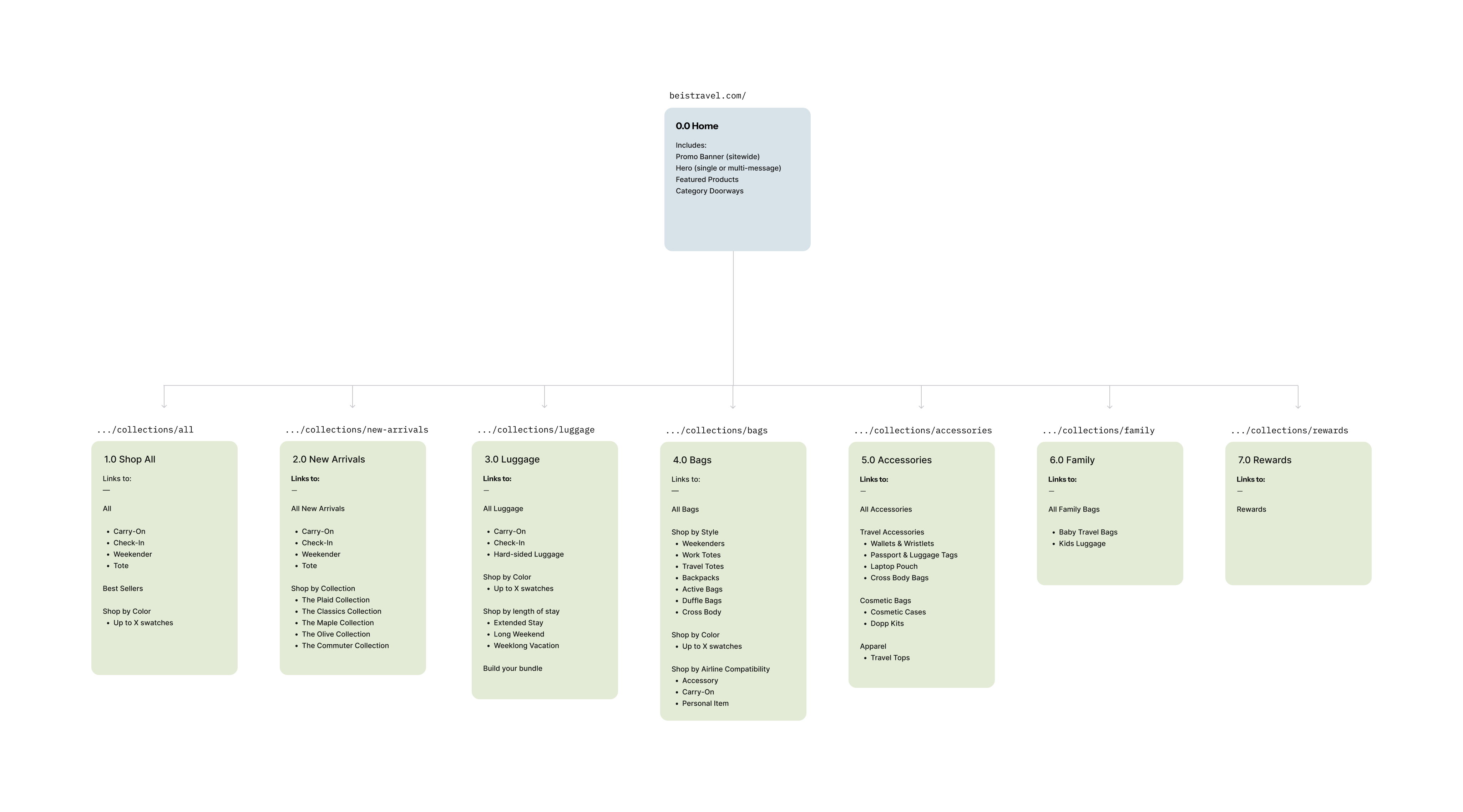
Like many e-commerce sites as the product line evolves and shopping trends change the site information architecture was in need of a refresh.
Role: UX Designer
Employed by: Béis

Challenge
Béis was in need of a refresh of their information architecture to match their evolving product catalog and a navigation that matched the modern expectations of their shoppers. As a brand that blurs the line between fashion and travel shopping behaviors spanned from pragmatic and functional shoppers to explorers deciding based on style and colorways.

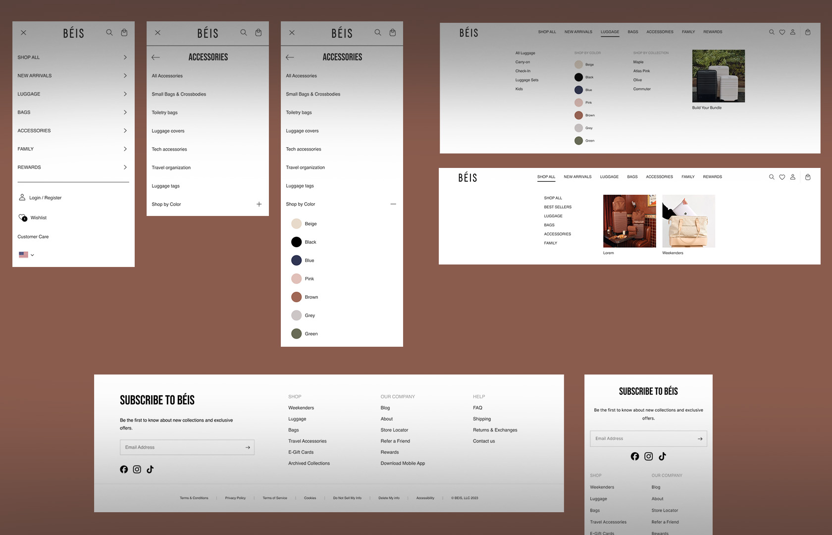
Streamline and Simplify
We elevated the navigation experience by introducing shopping by color which for travel luggage was not the norm in navigation and generally handled with filters on product listing pages. Minimizing branded language in the nav and simplifying category headers ensured that shoppers new to the brand would be able to easily find product they were interested in.


